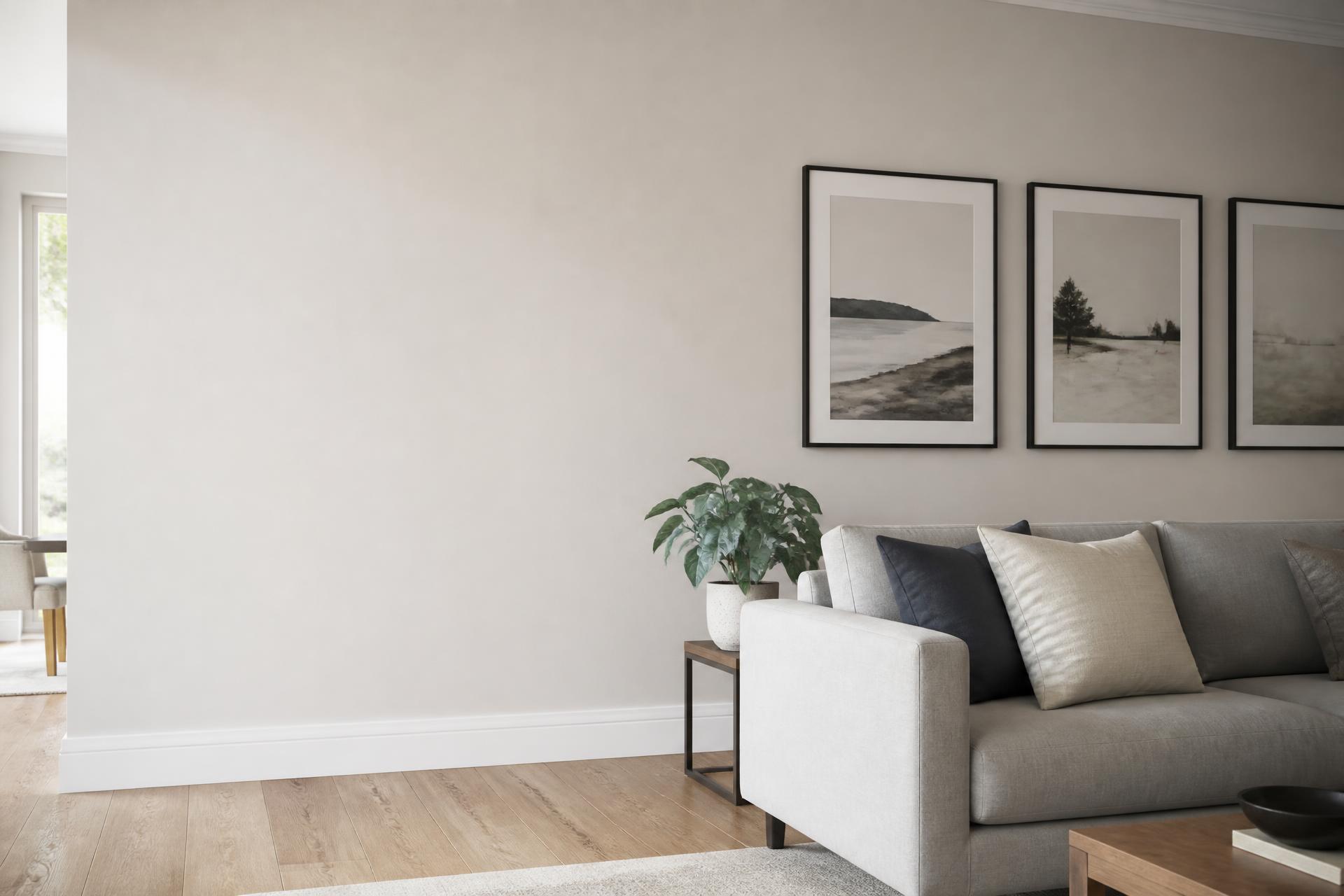
A horror poster wall looks best when it has been planned like any other gallery wall. The subject matter is loud enough already, so the layout should be quiet. This is the method we use when we lay out a wall in the studio.
Choose three to five posters
Fewer than three looks like a couple of prints that happen to be near each other. More than five on a typical living room wall starts to feel cluttered, especially with busy horror artwork. Lay your shortlist on the floor and take a photo from above. If anything fights for attention, take it out.
One hero, the rest supporting
Pick a single hero poster at A2 or A1. This is the one people will look at first, so make it your favourite film or the strongest image. Around it, use two to four smaller prints at A3 or A4. Darker, simpler artwork works best for the supporting prints: a cult VHS cover, a typographic quote, a retro title card.
Keep every print portrait if you can. Horror one-sheets are almost always portrait, and mixing orientations on a small wall makes it look accidental.
Spacing and height
Leave 5 to 8 cm between frames and keep that gap consistent. Hang the centre of the whole group at roughly eye level, about 145 cm from the floor, rather than lining up the top edges. Over a sofa, leave 20 to 25 cm between the furniture and the lowest frame.
Line up either the centres or one shared edge. Pick one rule and stick to it.
Framed or unframed?
Black frames suit almost every horror print and make a mixed set look intentional. Unframed prints with poster strips are fine for a short seasonal display, but the corners will curl over time on anything above A3. All our prints are true A-sizes, so standard UK frames fit without trimming. The poster size guide lists the exact dimensions.
Putting it together
Start with the hero, hang it first, then work outwards. If you want ideas on palette and style before you choose, our Halloween poster ideas piece covers that. Then browse horror posters or look through retro and cult film prints.